It's time to upgrade your browser

Your current browser is no longer supported on llbean.com. Please upgrade to one of the following for a smoother, safer shopping experience with us:

Men's Slim Fit Graphic Tees

Explore men's slim fit graphic tees for a closer-fitting take on the classic T-shirt. Browse graphic designs to find a look that feels like you, and check individual product details and size charts to help choose your fit.

Read More
Men's Bean's Access Trail Tee, Graphic
L.L.Bean Men's Bean's Access Trail Tee, Graphic
A yellow men's graphic performance T-shirt in a quick-drying, wicking antimicrobial recycled-polyester blend.
(0)
$34.95 $19.99
SALE
$34.95 $19.99
SALE
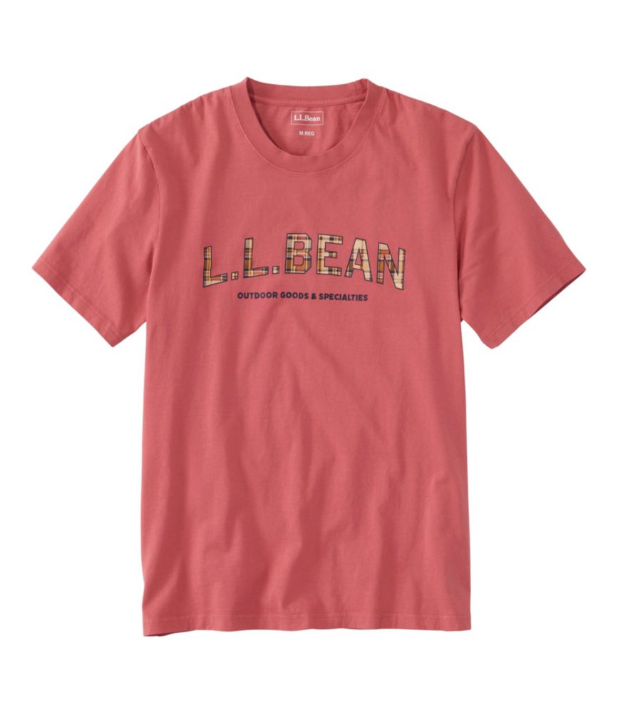
Men's Sunwashed Tee, Short-Sleeve, Graphic
L.L.Bean Men's Sunwashed Tee, Short-Sleeve, Graphic
A multicolor cotton T-shirt with a soft garment-dyed finish, retro graphic, and classic crewneck styling.
(0)
$39.95 $24.99
SALE
$39.95 $24.99
SALE
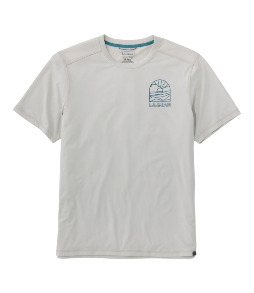
Men's Bold Coast Lifestyle Tee, Short-Sleeve Graphic
L.L.Bean Men's Bold Coast Lifestyle Tee, Short-Sleeve Graphic
A gray performance T-shirt in recycled polyester blend with quick-drying, moisture-wicking fabric and UPF 50+ protection.
(0)
$49.95 $29.99
SALE
$49.95 $29.99
SALE
Men's Hunter's Graphic Tee
L.L.Bean Men's Hunter's Graphic Tee
A gray cotton-blend graphic T-shirt with moisture-wicking, quick-drying performance and hunting-inspired artwork.
(0)
$29.95 $29.95
SALE
$29.95 $29.95
SALE

Men's Slim Fit Graphic Tees

Men’s slim fit graphic tees bring together a closer-cut silhouette and the personal expression of a printed design. The fit gives the shirt its shape; the graphic gives it character. Compared with a roomier cut, a slim fit generally follows the chest and torso more closely, with less extra fabric through the body. That distinction matters when the goal is a neat outline rather than a loose or oversized look. Slim does not have to mean tight, and the label alone cannot tell the whole story: shoulder placement, sleeve shape, body length, and individual proportions all affect how a tee looks when worn. A shoulder seam that sits near the edge of the shoulder creates a different impression from one that drops farther down the arm. Likewise, a sleeve that follows the upper arm can make the overall shape look more defined, while the hem determines how the shirt relates to the waistband beneath it. Comparing a size chart with the measurements of a favorite tee is a practical starting point, especially when that favorite already has the desired shape. Chest measurements deserve attention, but length is worth checking, too; two shirts with similar widths can look quite different if their hems fall at different points. For someone who usually chooses a relaxed fit, selecting a slim cut in the appropriate size is more useful than simply buying a smaller shirt. Sizing down changes several dimensions at once and does not necessarily create the intended proportions. The aim is a shirt that follows the frame without pulling the printed artwork out of shape. When the fit and design work together, a graphic tee can feel personal without making the rest of an outfit complicated.

The appeal of a graphic tee often begins with a small visual detail: the arrangement of the lettering, the balance of an illustration, or the way a print stands out against its background. Those details are worth considering alongside the cut. A compact chest graphic leaves more of the shirt visually quiet, while a larger composition makes the artwork a more prominent part of the look. Neither approach is inherently better; the choice depends on how much attention the wearer wants the design to draw. Someone whose wardrobe is mostly understated may prefer artwork with a simple outline or a limited palette. Someone who enjoys expressive clothing may be drawn to a bolder composition or a design with a recognizable point of view. Looking at the graphic as a whole, rather than just its subject, helps clarify that preference. Lettering can be spare and orderly or become the main visual element, and an illustration can read very differently depending on its scale and placement. With a slim silhouette, the relationship between the print and the shirt’s narrower shape is especially noticeable. Consider where the artwork sits across the chest and how much space surrounds it. Styling can stay straightforward: a graphic tee paired with plain pants gives the design room to stand on its own, while repeating one color from the artwork elsewhere creates a subtle connection. There is no need for every piece to match. An open shirt can frame the graphic, though the effect depends on how much of the artwork remains visible. The hem also changes the balance; leaving it untucked keeps the full outline of the tee in view, while tucking it changes the proportions. For another take on a closer-cut shirt, men’s slim fit cotton shirts offer a related category to explore. Keeping the preferred silhouette consistent leaves room to vary the visual character of the wardrobe.

Choosing among men’s slim fit graphic tees is ultimately a matter of bringing together shape, design, and the details that matter to the person wearing them. A clear view of the front and back helps establish the full design, particularly when the artwork extends beyond a single chest placement. Close-up images can reveal details in the illustration or lettering that are less apparent in a small thumbnail. Product descriptions and size information should fill in the rest, including fabric composition, measurements, and care directions. Those details belong to the individual shirt rather than to the graphic tee category as a whole. When material preferences are important, checking the listed composition is more reliable than guessing from a photograph or assuming that similar-looking tees are made alike. Care deserves the same attention: follow the shirt’s own washing and drying instructions, including any directions specific to the printed design. A slim fit label describes a silhouette, not a fabric, care routine, or promise of durability. For someone replacing a well-liked tee, it helps to identify exactly what made the original a favorite. Perhaps it was the body length, the placement of the sleeves, or artwork that felt expressive without dominating the outfit. Separating those preferences makes comparison more useful than searching for a shirt that merely looks similar at first glance. The same thoughtfulness applies when choosing a graphic tee as a gift. A familiar interest can be a starting point for the design, but the recipient’s usual clothing choices matter just as much. A person who favors small, quiet graphics may appreciate a different approach from someone who enjoys a prominent print. Confirming that a closer fit is welcome is especially helpful; an appealing illustration cannot compensate for a silhouette the recipient would not normally choose. For personal shopping or gift giving, the strongest choice is not necessarily the most elaborate design. It is the tee whose proportions and artwork feel right together, reflect the wearer’s preferences, and make sense alongside the clothing already in the closet.
Read More

FAQs