
It's time to upgrade your browser

Your current browser is no longer supported on llbean.com. Please upgrade to one of the following for a smoother, safer shopping experience with us:

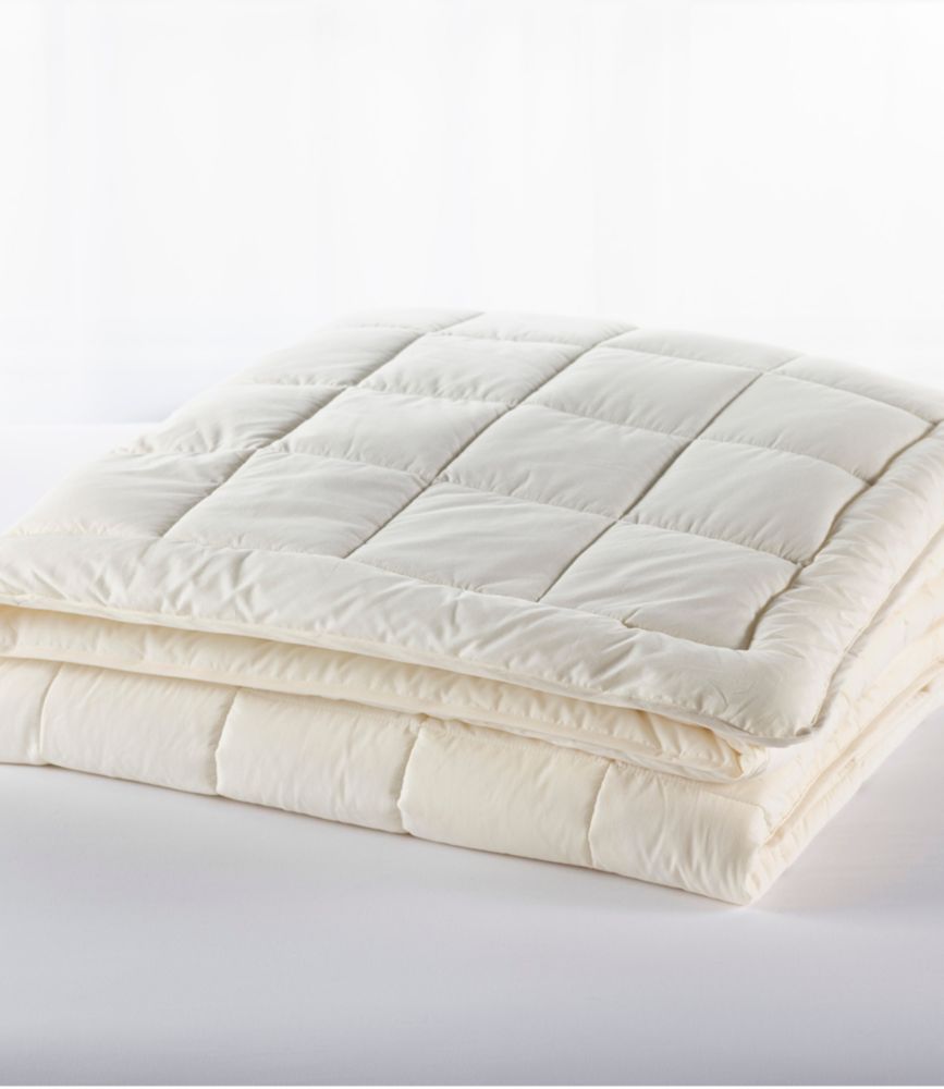
Cream Comforters

Find cream comforters in a versatile neutral shade that’s easy to coordinate with your bedroom’s color palette. Whether you prefer a tonal look with ivory and beige bedding or a contrast with deeper colors, cream offers a timeless starting point.
Read More
Ultrasoft Cotton Comforter
L.L.Bean Ultrasoft Cotton Comforter
A white, brushed cotton comforter with moisture-managing TENCEL™ Lyocell fiberfill and year-round comfort.
(2,252)
$190 $190
SALE
What customers like:
Perfect fit
Warmth
Softness
Durability
Comfortable
$190 $190
SALE
Classic Colors Down Comforter
L.L.Bean Classic Colors Down Comforter
A tan cotton comforter with fluffy 600-fill European duck down, sewn-through box stitching and year-round warmth.
(542)
$400 $400
SALE
What customers like:
Warm down
Durable
Comfortable
Soft
Washable
$400 $400
SALE
Cloud Gauze Comforter Collection
L.L.Bean Cloud Gauze Comforter Collection
A tan cotton comforter with four layers of breathable gauze, lightweight warmth, and polyester fill.
(0)
$280 $280
SALE
$280 $280
SALE

Cream Comforters

Cream comforters bring a familiar, understated color to the center of a bedroom, leaving plenty of room for personal style. Cream sits close to white but has a warmer cast, often with hints of yellow, beige, or ivory. Those subtle differences matter when the comforter covers a large part of the bed: a pale cream can look almost white beside a dark headboard, while a richer shade may read more distinctly against crisp white sheets. Rather than expecting every cream-colored piece to match exactly, look for colors that share a similar undertone. A cream comforter beside oatmeal-colored curtains and a taupe rug creates a close grouping of neutrals; the same comforter against deep blue walls offers a clearer contrast. Neither approach needs a room full of new furnishings. An existing dresser, a favorite framed print, or the color of the floor can provide the starting point for the whole arrangement. Cream also leaves space for patterns without adding another strong color to the mix. Narrow stripes, small checks, and botanical prints can each take a different direction around the same neutral centerpiece. For a restrained look, repeat one accent color in just a few places, such as a pillow and a picture above the bed. For a more collected look, combine patterns of different sizes while keeping their backgrounds close in tone. The appeal is in the balance: the bed has a clear presence, but the rest of the room still feels like part of the picture. When comparing cream comforters, look beyond the color name to the photographs and written color descriptions. Ivory, ecru, off-white, and cream can overlap in everyday language, but they are not reliable promises of an identical shade. The most useful comparison is with the colors already in the room, especially any white or pale neutral surfaces that will sit directly beside the bedding.

The way a cream comforter looks on the bed depends as much on proportion and detail as on its shade. A broad, uninterrupted expanse of cream creates a different impression from a surface divided by visible stitching or framed by an edge detail. As those elements appear in individual product descriptions, consider whether they echo something already in the room or introduce a welcome contrast. Straight lines can pick up the geometry of a paneled headboard or a checked pillowcase, while a less structured arrangement of accessories keeps the setting from looking overly coordinated. A bed with cream bedding, a dark green accent pillow, and a simple bedside lamp can feel complete without a stack of decorative extras. Elsewhere, a patterned rug and colorful artwork may already provide all the detail the room needs. It helps to decide what should draw the eye first. If the headboard is the focal point, keep the surrounding bedding arrangement straightforward; if the bed itself anchors an otherwise quiet room, pay closer attention to the comforter’s visible edges and overall proportions. Check listed dimensions rather than relying only on a bed-size label, and compare those measurements with the mattress and the amount of overhang preferred at each side. Mattress depth, the height of the bed frame, and whether a side rail is meant to remain visible all affect the finished appearance. A photograph may show a different bed setup, so measurements offer a more useful point of reference than the image alone. Think about the view from the doorway, too: that is often where the relationship between the comforter, floor, and nearby furniture is easiest to judge. A cream edge against a darker frame makes the outline of the bed distinct, while pale bedding beside pale furniture creates a closer tonal relationship. These small choices give a neutral bedroom its character without depending on elaborate decoration.

Choosing among cream comforters also means looking closely at the details that a color-focused search cannot tell the whole story about. Read each product description for its composition, construction, dimensions, and care directions rather than treating similar photographs as evidence that two comforters are alike. Keep appearance and practical requirements separate during the comparison: the right shade is one consideration, while the stated care process is another. Check care instructions before choosing, including any equipment requirements or professional-care directions, and consider whether that process fits the household’s routine. Where coordinating pieces appear in a photograph, confirm what the product description actually includes. A styled bed can contain several separately described elements, and understanding those distinctions makes it easier to plan a complete arrangement without duplicating pieces already at home. There is no need for every part of that arrangement to be cream. White pillowcases can make the difference between the two shades intentional, while terracotta, muted rose, or olive accents introduce color without overwhelming the neutral foundation. Black picture frames or dark drawer pulls can add definition elsewhere in the room, especially when the larger surfaces are pale. For a nature-inspired palette, take cues from familiar combinations such as sandy tones beside stone gray or muted green beside brown. Keep the selection personal rather than trying to reproduce a room photograph exactly; a quilt displayed nearby, a family photograph, or a well-loved bedside table often contributes more character than a perfectly matched set of accessories. That preference for understated color can carry into other choices, including cream cashmere sweaters, without requiring every cream shade to be identical. In the bedroom, the same freedom makes it possible to bring together pieces chosen at different times. A cream comforter can be the visual starting point or the quieter companion to furnishings that already stand out. The most satisfying choice is one whose shade, proportions, visible details, and stated care requirements make sense together, creating a bed that belongs naturally in the room rather than looking separate from it.
Read More

FAQs